8 Graphic Design Principles for Stunning Visuals
Master the essential graphic design principles that make visuals impactful, professional, and unforgettable.
25th September, 2025
8 Graphic Design Principles for Stunning Visuals
Great graphic design is more than just artistic talent; it's a science. It relies on a set of fundamental principles that guide how visual elements are arranged to create something that is both beautiful and effective. Understanding these principles is what separates amateur designs from professional work that captures attention, conveys a clear message, and helps a brand stand out.
Whether you're creating a social media post, a digital ad, or a website banner, implementing these basics can dramatically improve the quality and impact of your work. By mastering these principles, you’ll not only make your designs look beautiful but also ensure they connect with audiences and serve a real purpose. This guide will break down the eight fundamental principles of graphic design. We'll explore how to use each one to create compelling graphics and show you how a powerful tool like Phot.AI can help you apply these concepts effortlessly.
Alignment: Creating Order and Connection

Alignment is the unsung hero of clean design. It refers to the placement of text and graphics on a page, ensuring they are visually connected to each other. Proper alignment creates an orderly, organized appearance that is easy for the viewer's eye to follow. When elements are aligned, they don't feel random or disconnected; instead, they feel like they belong together, which makes the entire composition stronger.
There are two main types of alignment: edge alignment (left, right, center, top, bottom) and center alignment. Using a consistent alignment throughout your design creates a sharp, intentional look. A lack of alignment, on the other hand, can make a design feel messy and unprofessional.
Pro Tip: Achieving perfect alignment manually can be tedious. Phot.AI’s AI-powered smart guides and alignment tools automatically snap your elements into place. This allows you to position text, images, and shapes with precision, creating visually balanced and professional compositions in seconds.
Hierarchy: Guiding the Viewer's Eye
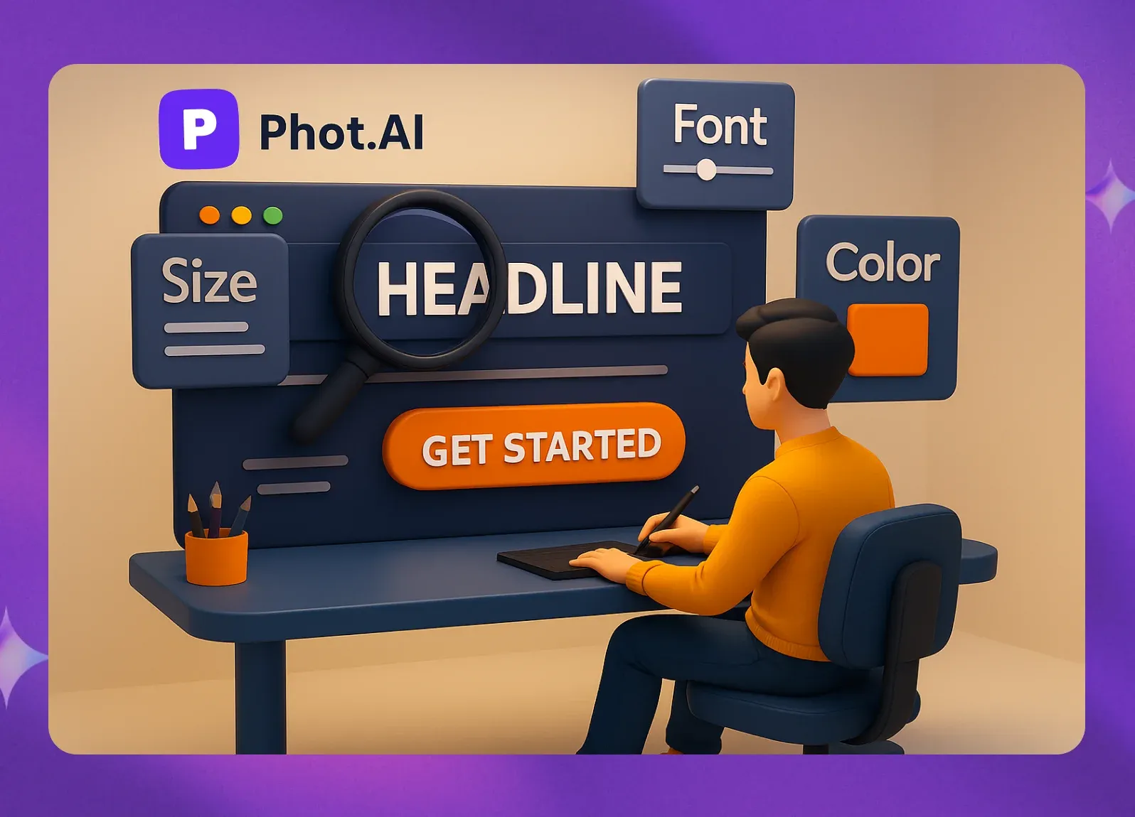
Not all information in a design is equally important. Visual hierarchy is the principle of arranging elements to show their order of importance. Through strategic use of size, color, contrast, and placement, you can guide the viewer’s focus to the most critical message first, and then lead them through the rest of the information in a logical sequence.
For example, a headline should be larger and bolder than the body text. A call-to-action button should use a contrasting color to make it stand out. A well-executed hierarchy ensures that your audience can scan the design quickly and understand the main takeaway almost instantly.
Pro Tip: With Phot.AI, you can easily establish a clear visual hierarchy. Customize font styles, adjust sizes, and experiment with bold colors to make your key message pop. Its templates are designed with hierarchy in mind, giving you a strong starting point for creating effective ads and posts.
Contrast: Making Your Design Pop
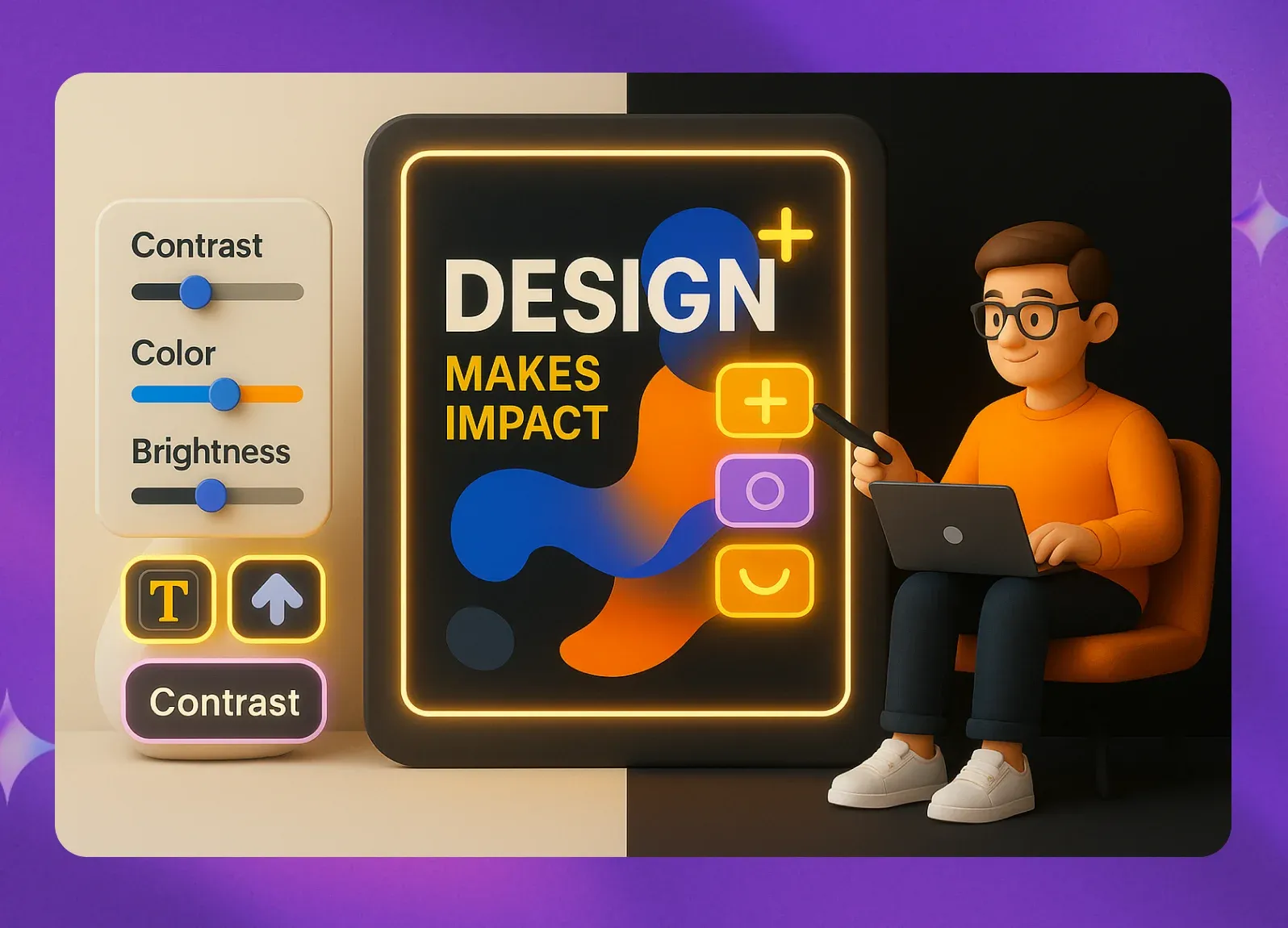
Contrast is what makes a design visually interesting and dynamic. It is created when two elements are strikingly different. This can be achieved through various means, such as pairing light and dark colors, using a bold, thick font with a thin, light one, or combining a large graphic with small text.
Contrast serves two main purposes: it creates visual excitement and it helps organize information by drawing attention to key elements. High contrast makes text more readable and helps important parts of your design, like a headline or a button, stand out. A design with low contrast can feel flat, boring, and difficult to navigate.
Pro Tip: Don't be afraid to be bold. Phot.AI’s editing tools make it easy to adjust colors, brightness, and saturation to create high-impact contrast. You can experiment with its built-in filters to make your images and text stand out, capturing your audience’s attention immediately.
Repetition: Unifying Your Design
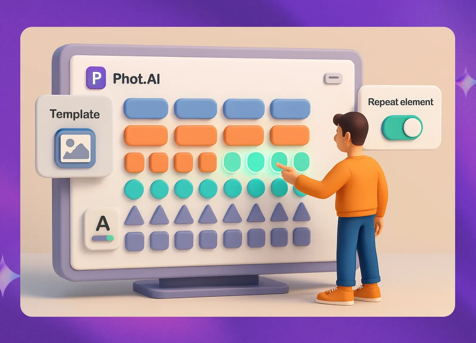
Repetition is a core principle for creating a cohesive and consistent brand identity. It involves reusing the same or similar elements throughout a design. This could mean repeating colors from your brand palette, using a consistent font style, applying a specific shape or pattern, or maintaining the same logo placement across different materials.
Repetition strengthens the overall design by tying together individual elements. It creates a sense of rhythm and familiarity, which helps build brand recognition. When customers see consistent visual elements, they learn to associate them with your brand, reinforcing your identity.
Pro Tip: Maintaining consistency across dozens of designs can be challenging. Phot.AI’s brand kit feature allows you to save your brand colors, fonts, and logos. You can then apply these assets to any template, ensuring all your graphics remain visually strong and on-brand.
Proximity: Organizing and Clarifying
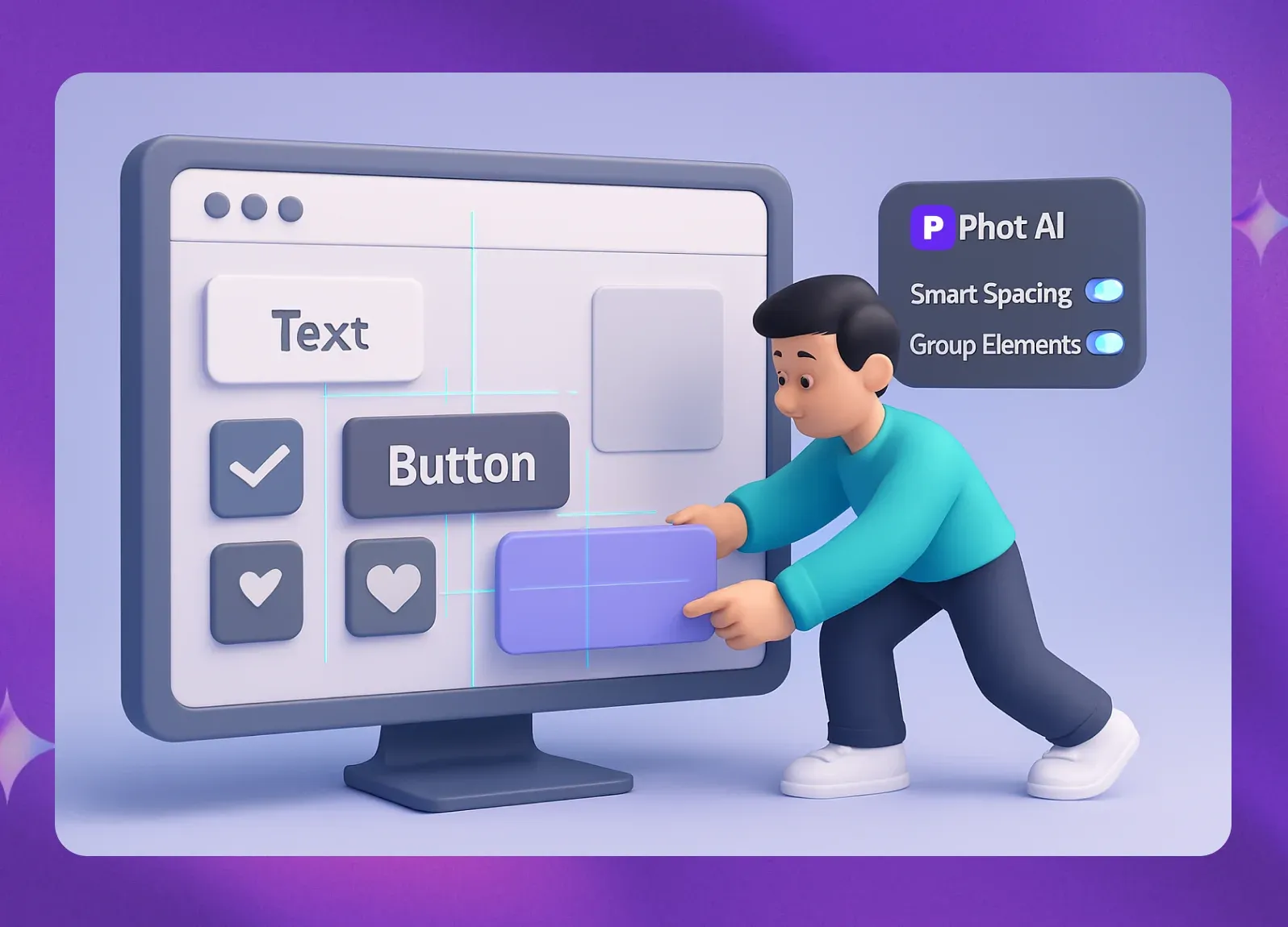
Proximity helps you organize information by grouping related elements together. Items that are related should be placed close to one another to create a single visual unit. This helps your audience understand the relationship between different parts of the design and makes the information easier to digest.
For example, an image and its caption should be in close proximity. A block of contact information (address, phone number, email) should be grouped together, separate from other content. By using proximity, you create a more organized layout that reduces clutter and improves readability.
Pro Tip: Phot.AI’s intuitive drag-and-drop interface makes it simple to group and arrange elements. Its smart spacing tools can even automatically adjust the spacing between items, helping you create clean, organized layouts without the guesswork.
Balance: Achieving Visual Harmony
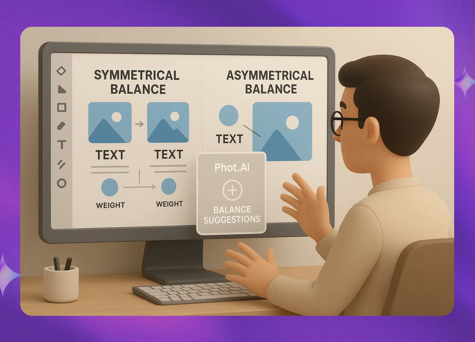
Balance is about distributing the visual weight of objects, colors, textures, and space in your design to make it feel stable and harmonious. Like a physical object, a design has a visual weight that needs to be balanced. There are three main types of balance:
Symmetrical Balance: Elements are mirrored on either side of a central axis. This creates a formal, stable, and orderly look.
Asymmetrical Balance: Elements are not mirrored, but their visual weights are still balanced. For example, a large, light-colored element on one side can be balanced by a small, dark element on the other. This often creates a more dynamic and modern feel.
Radial Balance: Elements radiate outward from a central point. The right type of balance depends on the mood you want to create, but every good design has it.
Pro Tip: Experimenting with balance is easy with Phot.AI. Its AI-assisted tools can offer suggestions for distributing elements to create a more harmonious composition. You can move items around freely to see what feels most visually appealing for your design.
Color: Evoking Emotion and Meaning
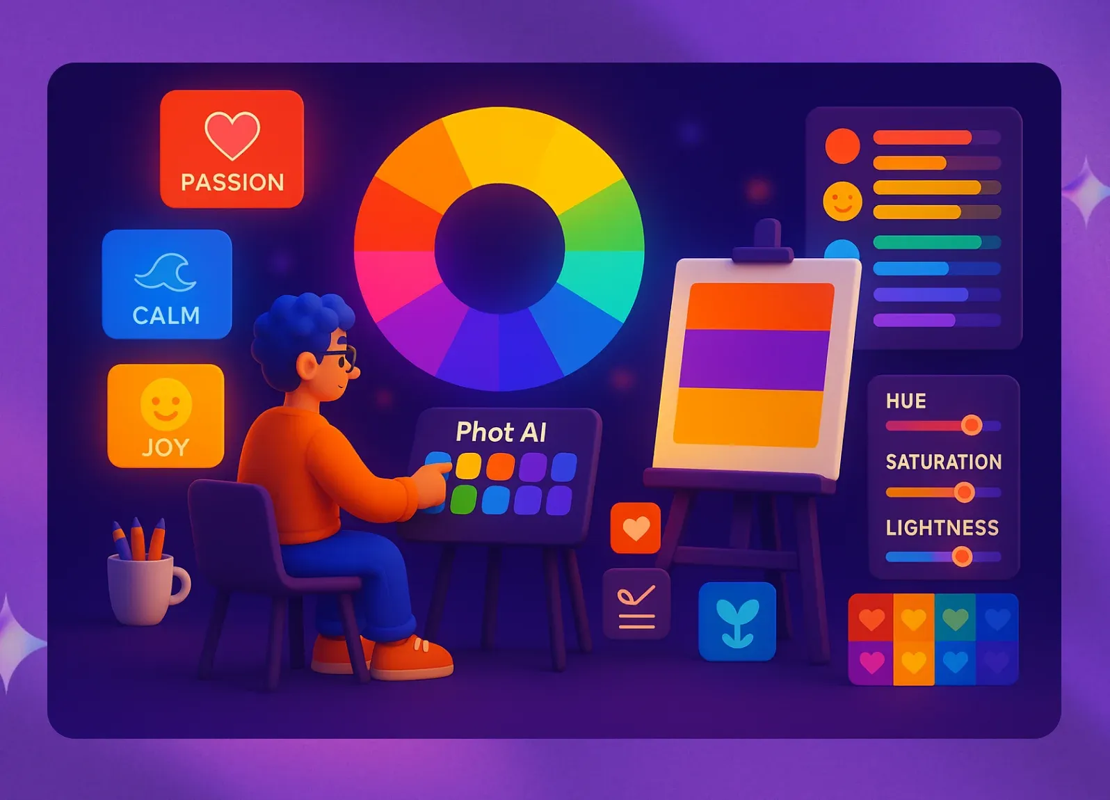
Color is one of the most powerful tools in a designer's toolkit. It does more than just add aesthetic appeal; it has psychological effects that can influence how people feel and respond to your design. Understanding basic color theory can help you choose a palette that evokes the right emotions and communicates the right message.
Warm colors like red and yellow can convey energy, passion, and urgency. Cool colors like blue and green can create a sense of calm, trust, and professionalism. The colors you choose should align with your brand's personality and resonate with your target audience.
Pro Tip: Finding the perfect color combination can be tough. Phot.AI’s AI color palette generator can suggest harmonious and effective palettes based on a single color you input or an image you upload. This takes the guesswork out of color theory and helps you find combinations that work.
Negative Space: The Power of Breathing Room
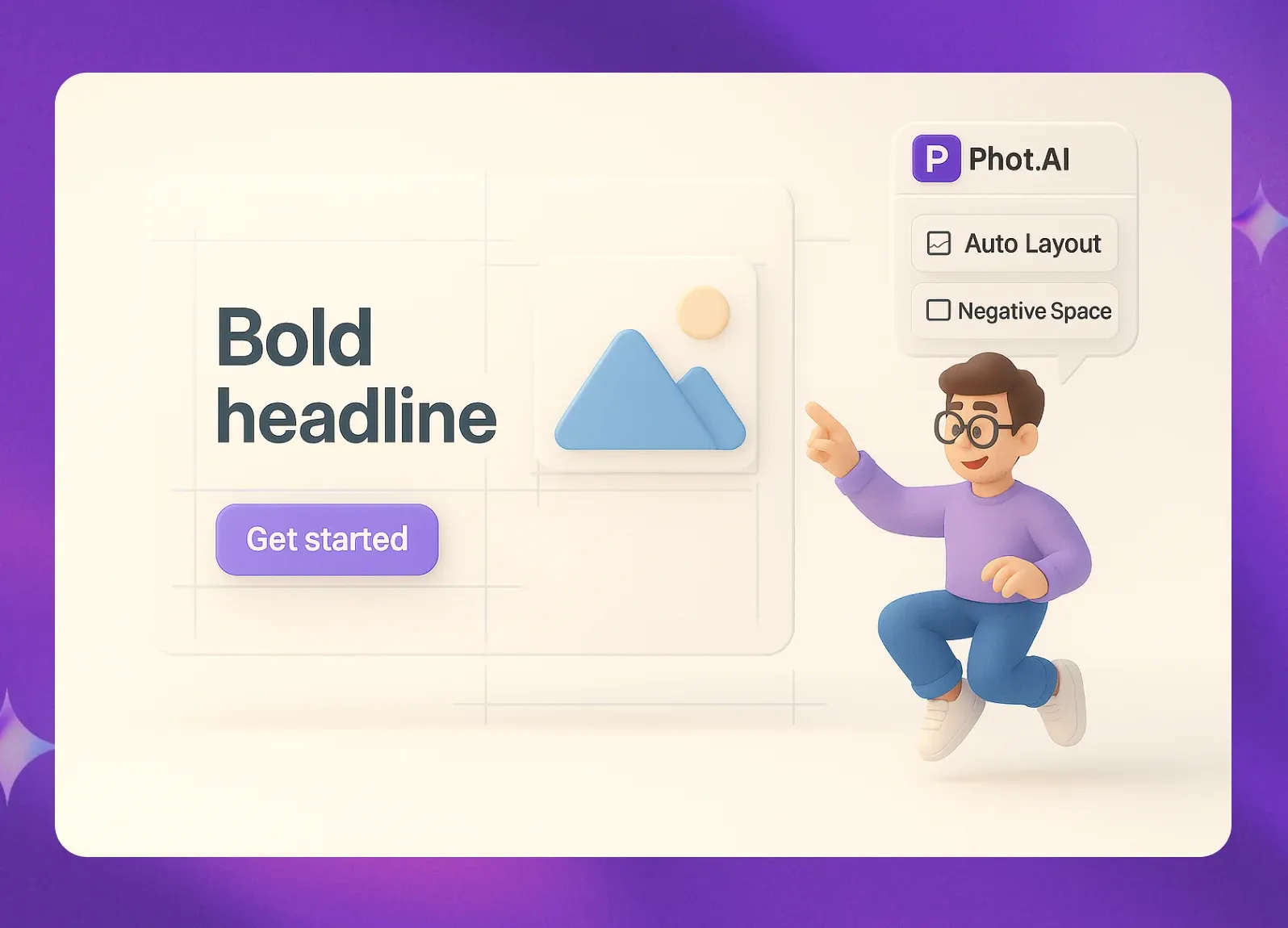
Negative space (also known as white space) is the empty area around and between the elements of your design. It is just as important as the elements themselves. Effective use of negative space provides breathing room for your content, making it easier for viewers to focus on the key information.
A design packed with too much text and too many graphics can feel cluttered, chaotic, and overwhelming. By strategically leaving some areas empty, you can create a more elegant, clean, and professional look. Negative space helps to define elements, create hierarchy, and guide the viewer's eye through the composition.
Pro Tip: Don't be afraid of empty space. Phot.AI’s layout tools allow you to easily adjust margins, padding, and the space between elements. Its templates are designed with ample negative space to ensure your final design feels balanced, clear, and easy to read.
Conclusion
Mastering these eight basic graphic design principles will fundamentally change the way you create visuals. By applying alignment, hierarchy, contrast, repetition, proximity, balance, color, and negative space, you can move from making designs that simply look "nice" to creating graphics that are strategic, professional, and highly effective.
With a powerful tool like Phot.AI, you have the ability to harness these principles without needing years of design experience. Its AI-driven features and intuitive interface make it easier than ever to create beautiful and impactful graphics that will captivate your audience, strengthen your brand, and elevate your marketing efforts.
Frequently Asked Questions
What are the 8 basic principles of graphic design?
The eight key design principles are alignment, hierarchy, contrast, repetition, proximity, balance, color, and negative space. Together, they create visually effective designs.
Why is alignment important in graphic design?
Alignment ensures elements are visually connected and organized, making designs look professional, cohesive, and easy to navigate.
How does contrast improve a design?
Contrast highlights differences in size, color, or typography to draw attention to key elements, improve readability, and add visual excitement.
What role does negative space play in design?
Negative space (white space) provides breathing room around elements, reducing clutter and making the overall layout more elegant and easier to read.
How can beginners apply these design principles easily?
Beginners can use AI tools like Phot.AI for smart guides, templates, and automatic color suggestions, making it simple to apply professional design principles.
Phot.AI Team
Creative Intelligence Platform